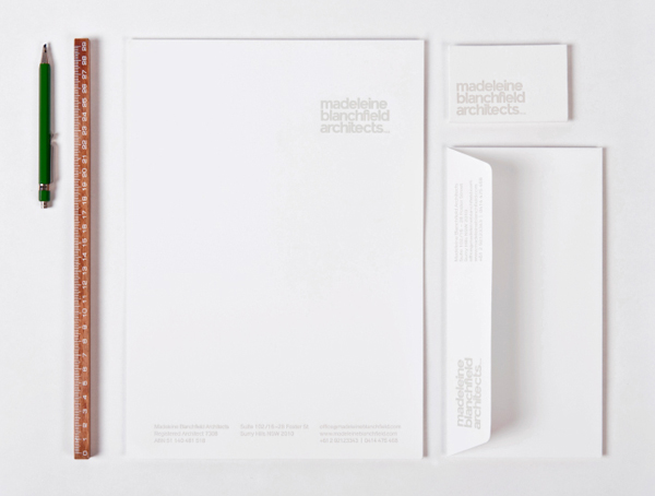
Madeleine Blanchfield is a Sydney-based architectural firm described by A Friend Of Mine, the design studio behind their new identity, as having a tactile and understated approach with an appreciation of light and detail. Qualities reflected through the subtle but tactile combination of material, print finish and ample space across the firm’s stationery.
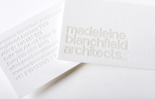
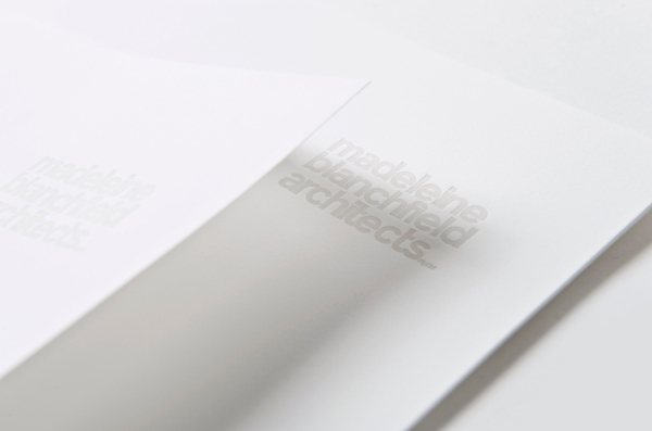
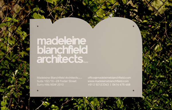
“It was important that we reflected the qualities inherent in their work when designing the brand identity. The logotype, drawing from 1960s swiss typography, was carefully customised with bespoke ligatures in the lettering to mimic subtle joinery details. To give a sense of light and air, the stationery is letter-pressed on thick cotton paper with a subtle tone to give a highly tactile feel. The site sign is cut out of an ’m’ shape to reinforce the name.”
- A Friend Of Mine
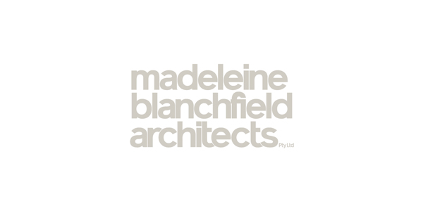
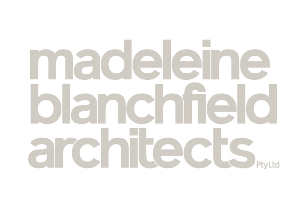
While the tight spacing, overlaps, ligature and all lowercase letter-forms of the logo-type infuse a proprietary personality and a sense of accessibility into a corporate classic, and perhaps implies an integrated and/or collaborative approach, the volume of characters across three compact lines looks heavy and a little cluttered. This however is well-tempered by the contrast and communicative impact of a really nice stationery solution that utilises a light colour and tactile letter-pressed print treatment across the fine texture but substantial weight of a fluorescent, cotton-white substrate and plenty of space. Choices that in conjunction with the customised sans-serif introduce a crafted character to the professional expectations of contemporary architectural services.
Visit the BP&O Logo Gallery for a chronological guide to all the identities reviewed on BP&O.
More identity work from A Friend Of Mine:


 |
Richard BairdRichard is a British freelance designer and writer who specialises in visual identities and packaging. He’s written for Brand New, Design Week and The Dieline, featured in Computer Arts magazine and also runs the resource Design Survival. |
The post Logo and Branding: Madeleine Blanchfield Architects appeared first on BP&O - Branding, Packaging and Opinion. richardbaird BP&O - Branding, Packaging and Opinion - Reviews, news and opinion on the latest logo, branding and packaging design work from around the world. Written by Richard Baird


